know shingles
know shingles
Logo design
Identity & positioning
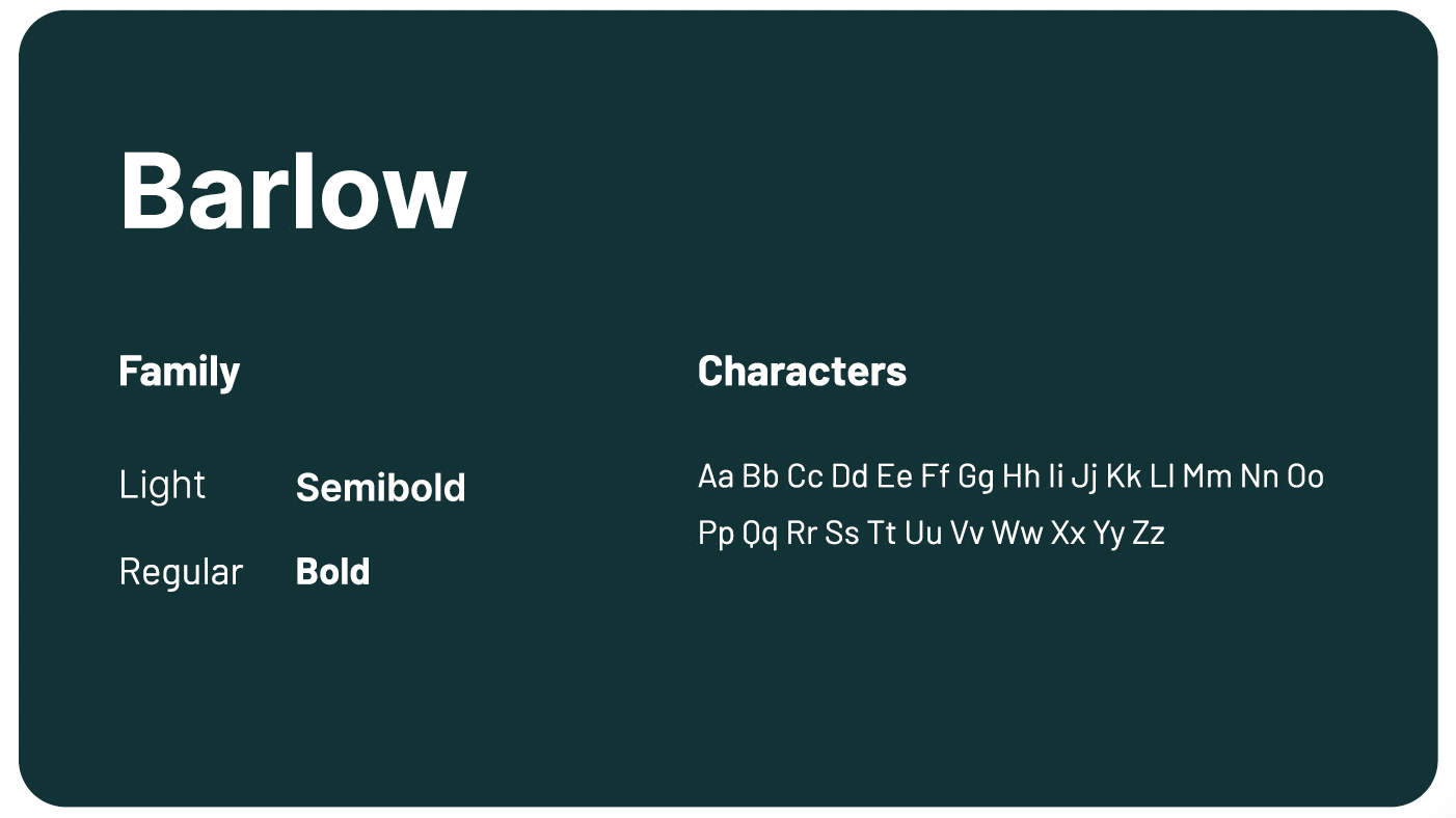
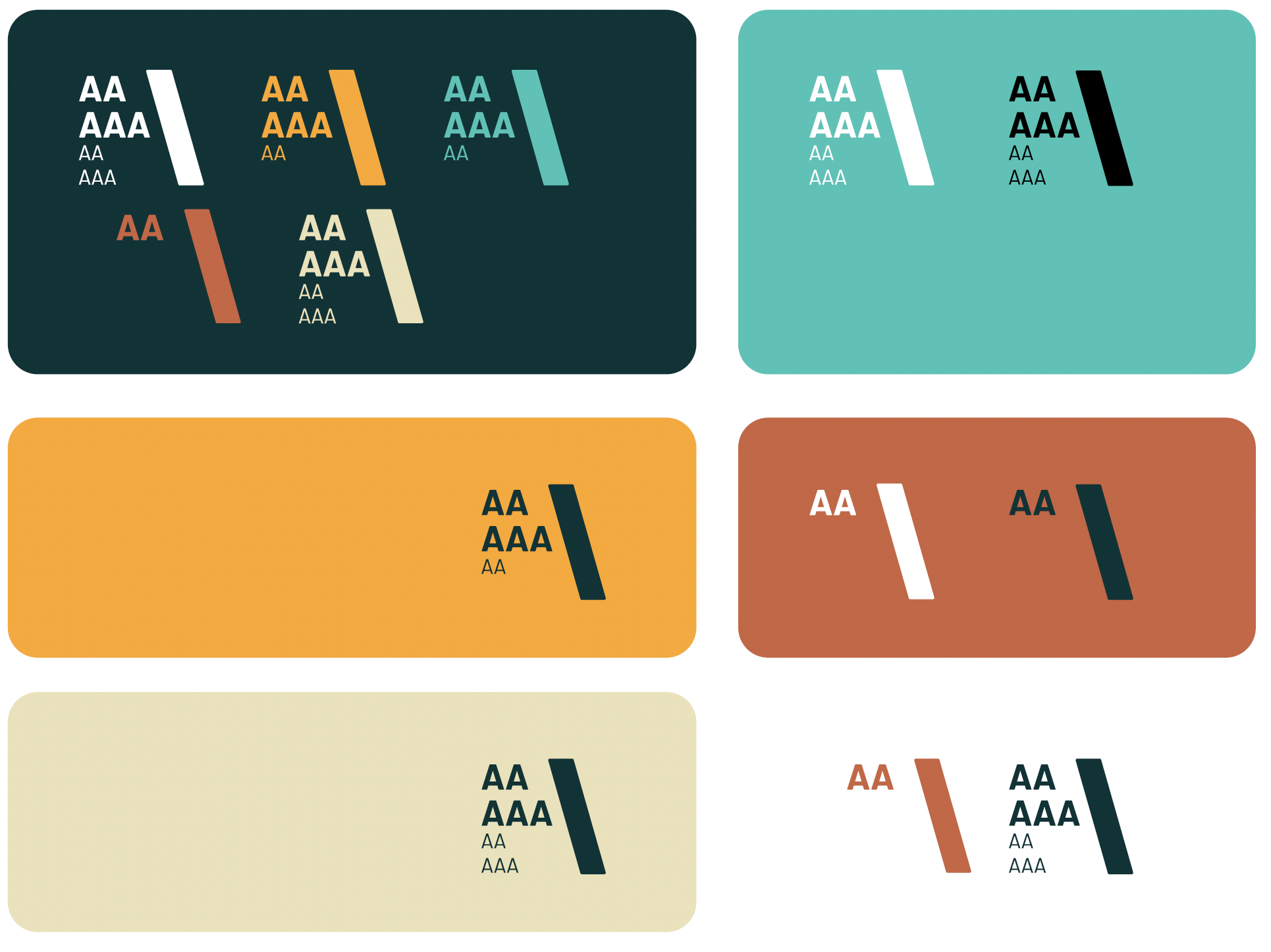
brand guidelines
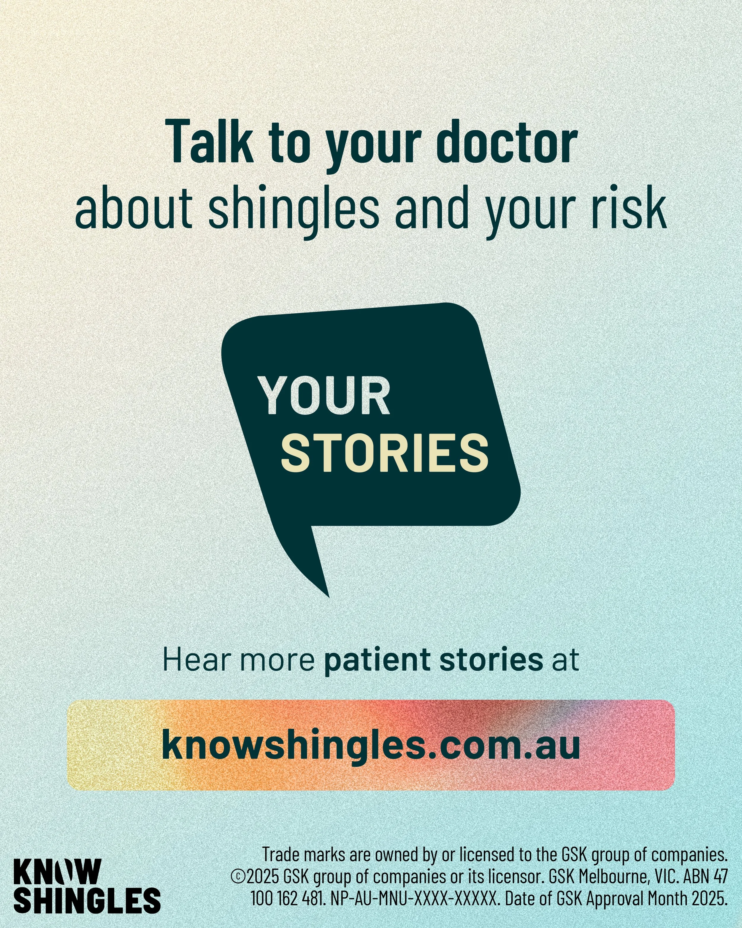
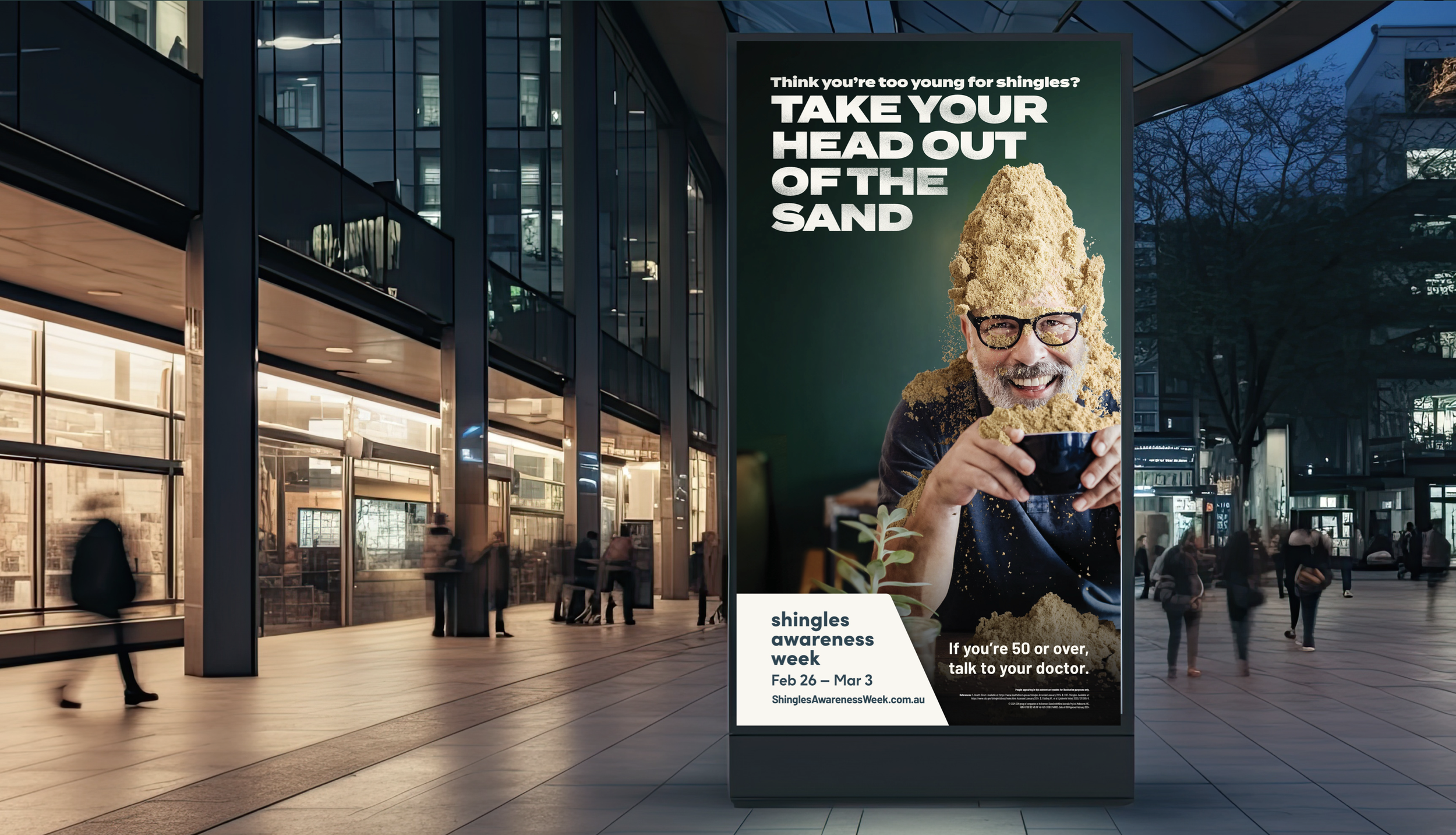
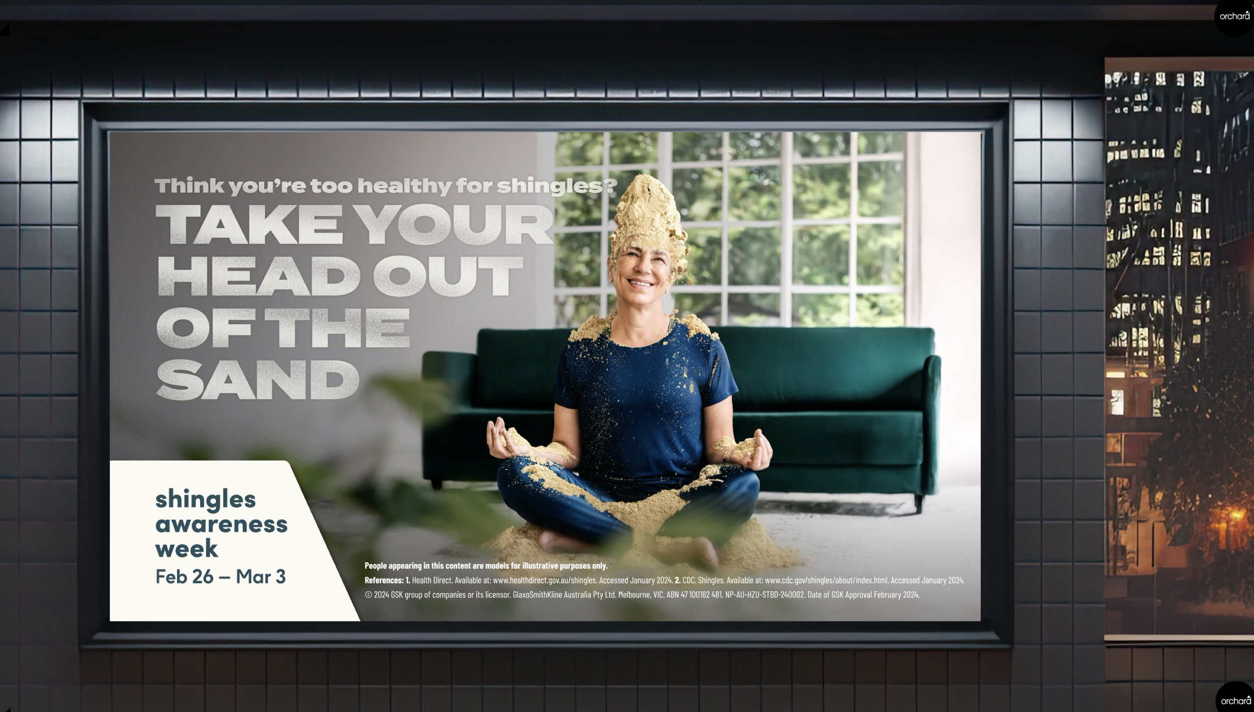
Print, digital & social templates
sub-brand identities
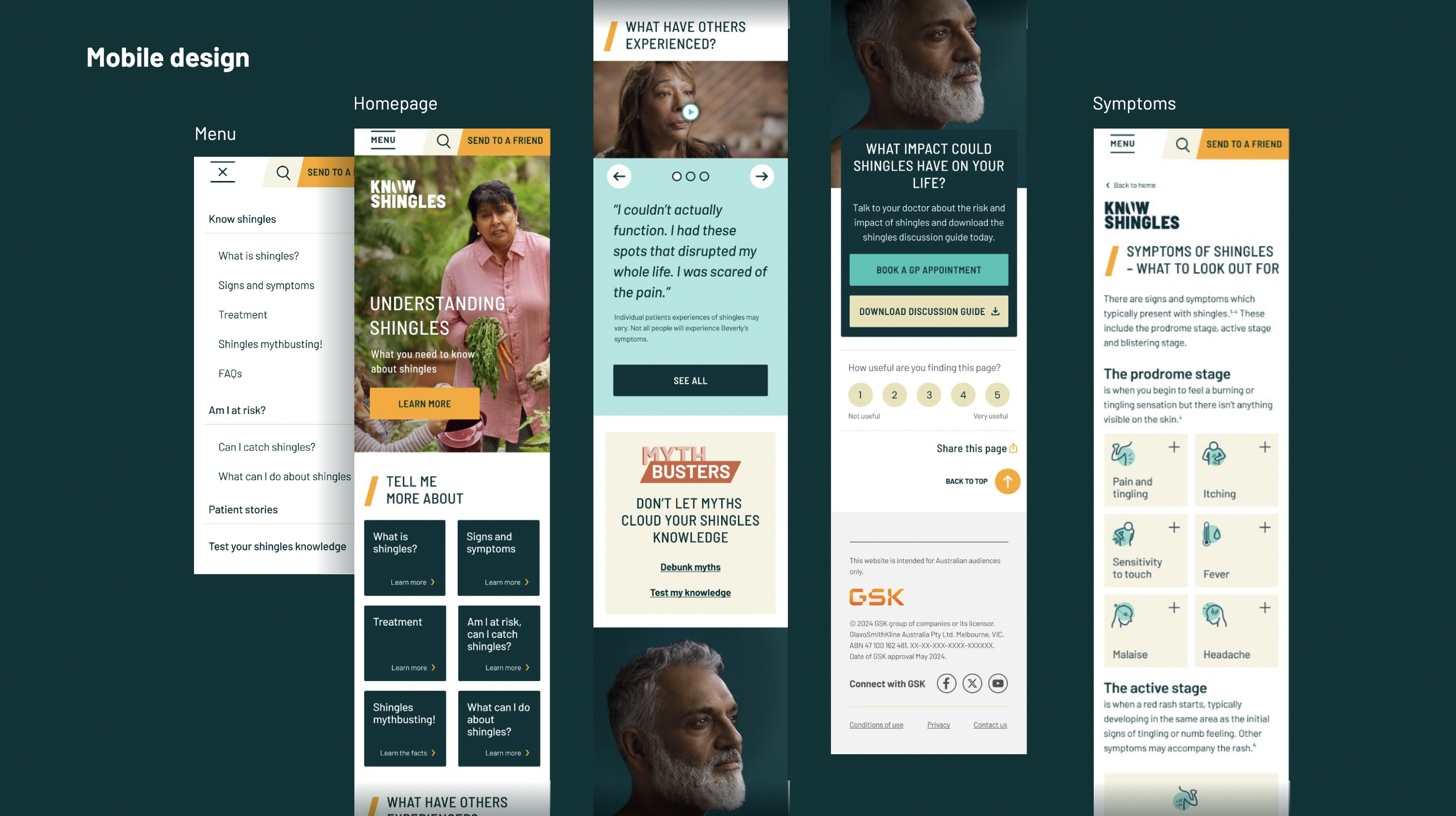
WEBSITE & ACCESSIBILITY
Brief:
Develop a cohesive visual identity for GSK’s shingles education materials, improving brand recognition, trust and message consistency across consumer and healthcare professional communications.
Outcome:
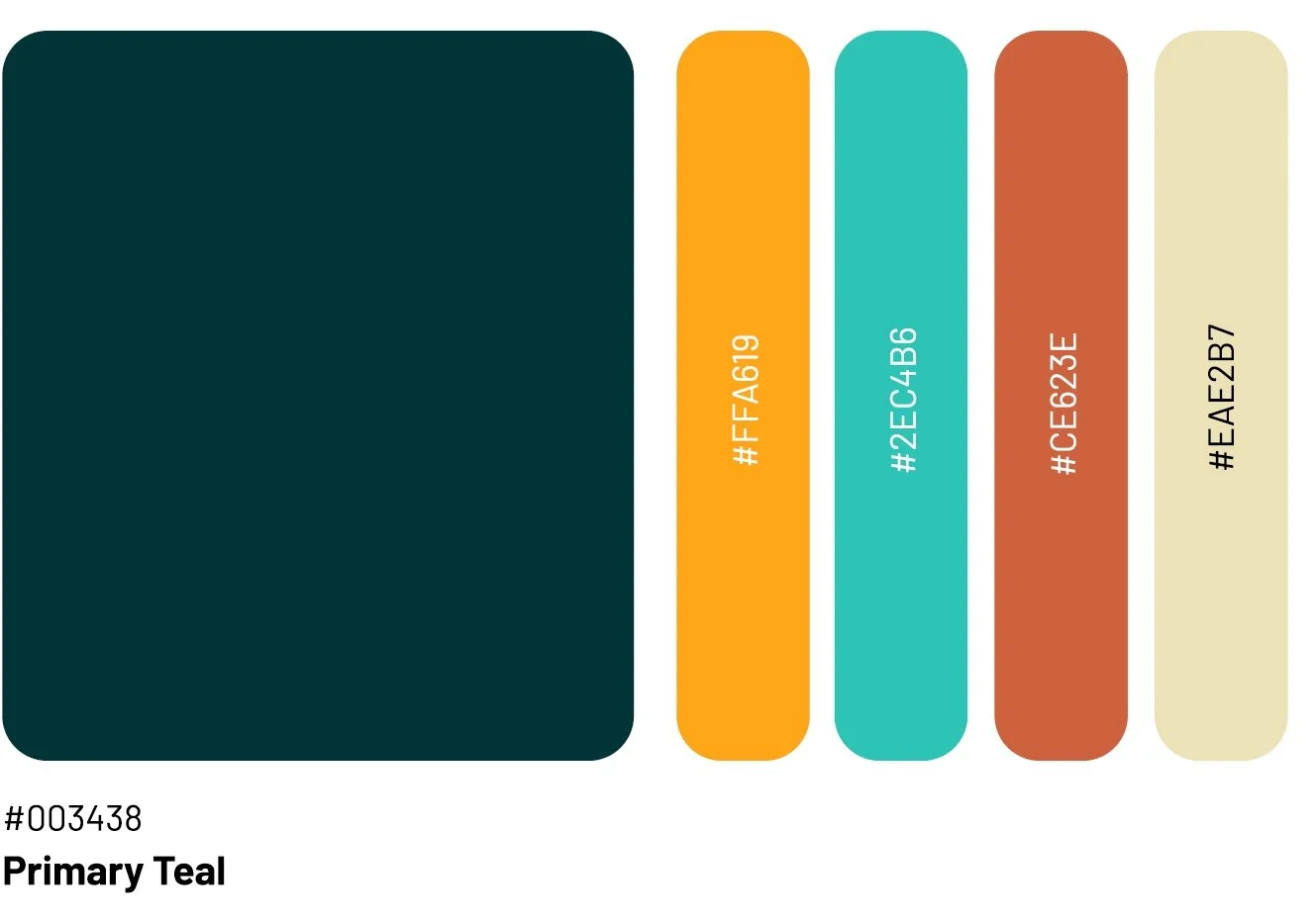
A unified brand system anchored by a refreshed logo and modernised visual identity. The design retains the brand’s recognisable teal palette and heritage cues while introducing a clean, contemporary framework across all touchpoints. Supported by comprehensive guidelines, the new identity strengthens clarity, credibility and engagement, creating a more recognisable and authoritative presence for shingles awareness communications.
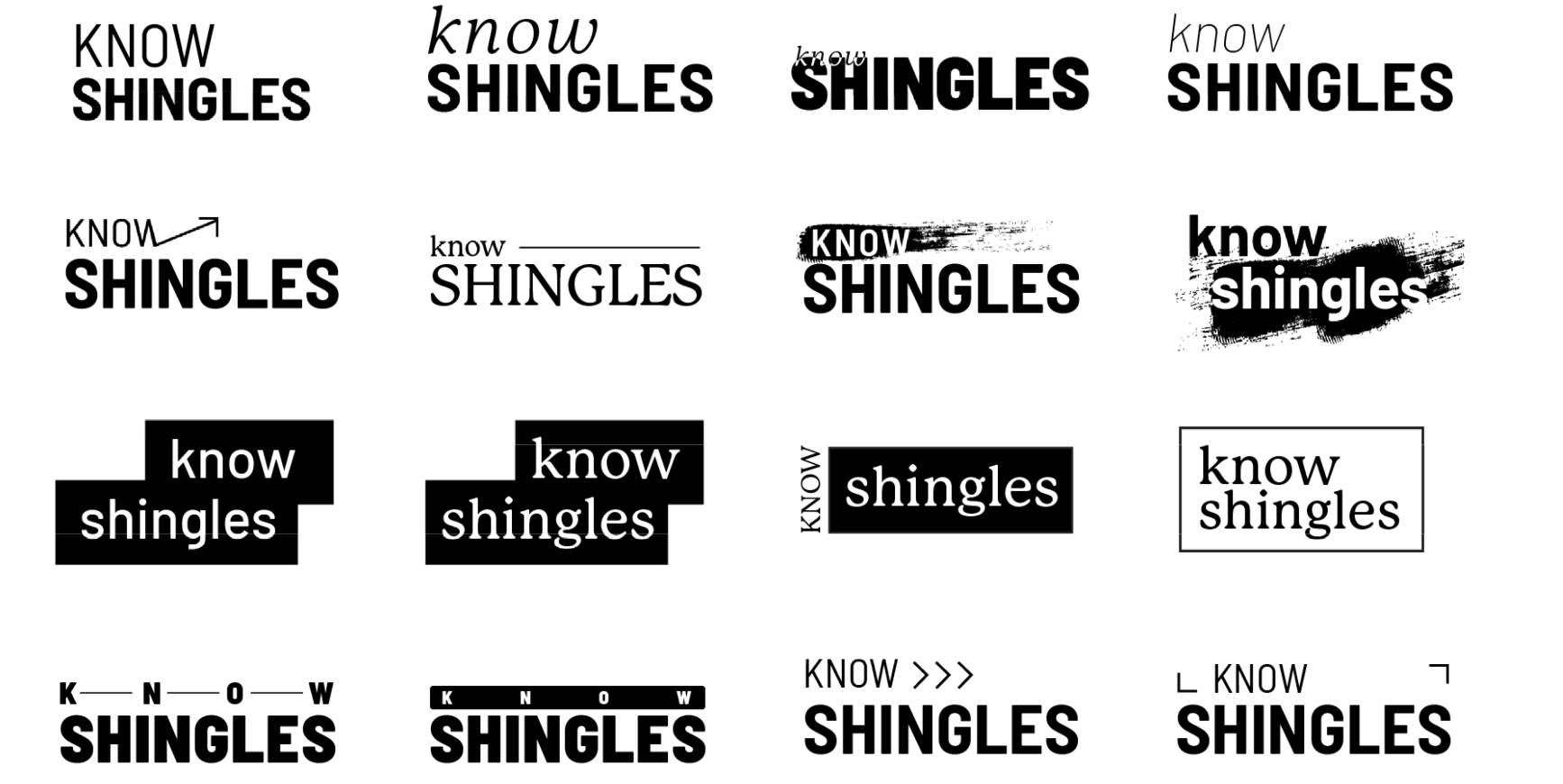
logo concepts
selects from brand guidelines
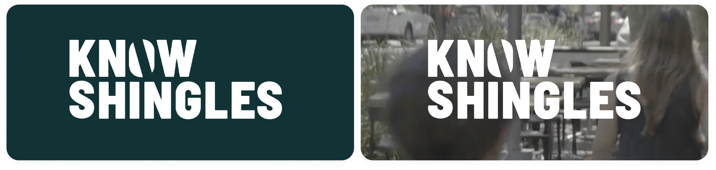

SUB-BRAND LOGOS & CAMPAIGN INTEGRATION

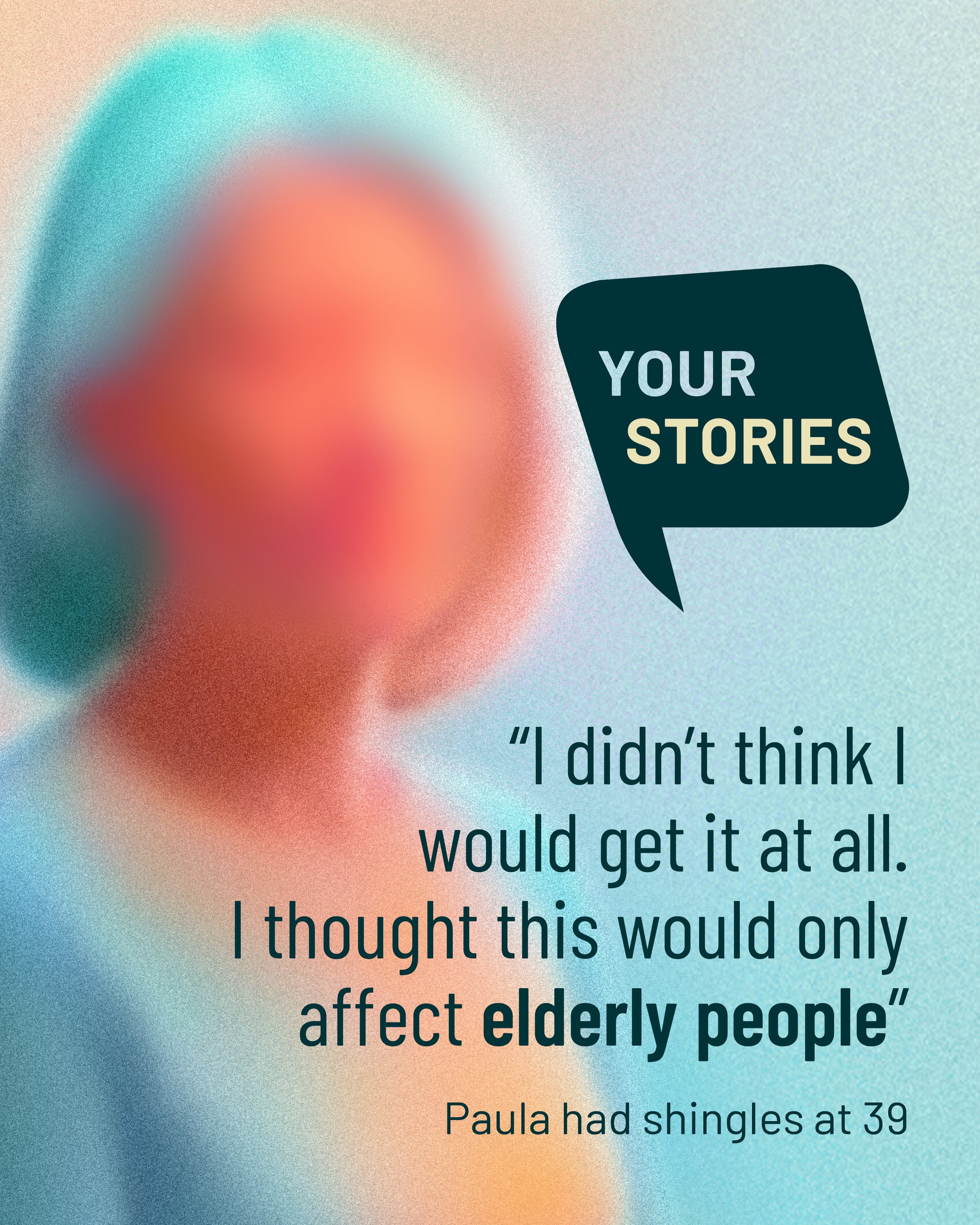
social media - anonymous stories